Fios TV+ Support
Making self-service simple
Challenge
Customers were struggling with vague and overly technical support content for Fios TV. FAQs were long, inconsistent, and bundled across products, making it nearly impossible to scan for relevant answers. As a result, support calls spiked around issues like LED indicator lights—questions that should have been quickly answered online. My challenge was to lead the UX writing strategy, reduce support friction, and create a scalable model for support content going forward.
My Role
As the Senior Content Strategist, I owned the content strategy for Fios TV Support. I conducted a content audit across FAQs, prioritized high-friction topics, and partnered with Support, Design, and Product teams to align updates with real customer pain points.
Process
Content Audit & Prioritization: Reviewed 60+ FAQs and discovered they were lumped together across multiple products, making it hard for customers to find what they needed. Identified the highest-impact topics driving support calls and prioritized them.
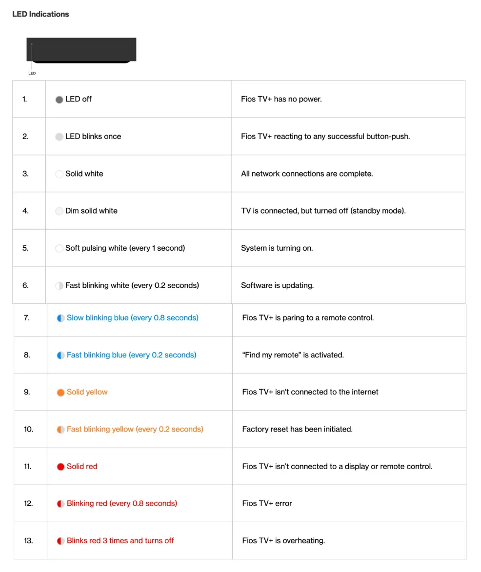
LED indication lights: adding clarity where it counts
We introduced a visual table to explain what each LED light meant.
In the left column, I added timing details in parentheses to give users precision. For example, instead of just Soft pulsing white, we wrote Soft pulsing white (every 1 second). This way, users didn’t have to guess at the speed or pattern.
In the right column, we added short, plain-language descriptions of what the light indicated. This gave users instant feedback on whether their device was working correctly or needed troubleshooting.
Visual support: To make the content more user-friendly, we paired the copy with a picture of the actual LED lights on the set-top box, so users could visually match what they saw on their device.
This combination of timing details, clear explanations, and visuals reduced ambiguity and made troubleshooting much faster.
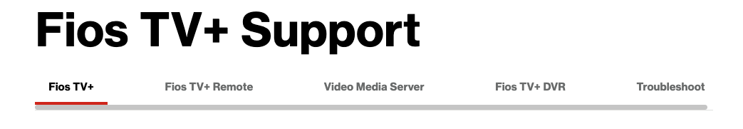
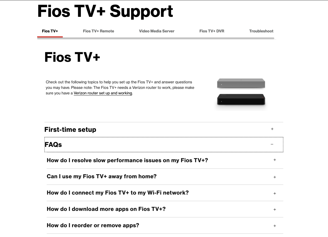
Information Architecture Redesign
Instead of lumping all the FAQs together for the user to parse through, we broken them up based on product.
Reduced cognitive load: Each product now has its own tab with FAQs, making information easier to fine.
Content Strategy Framework for FAQs
Established principles for clarity, brevity, and scannability. Rewrote answers into shorter, stepwise instructions with timing cues to help users quickly self-serve. Partnered with engineers and legal to validate accuracy and compliance, ensuring content was both precise and approachable.
Conducted user tests, validating that users could now scan and find answers in under 10 seconds.
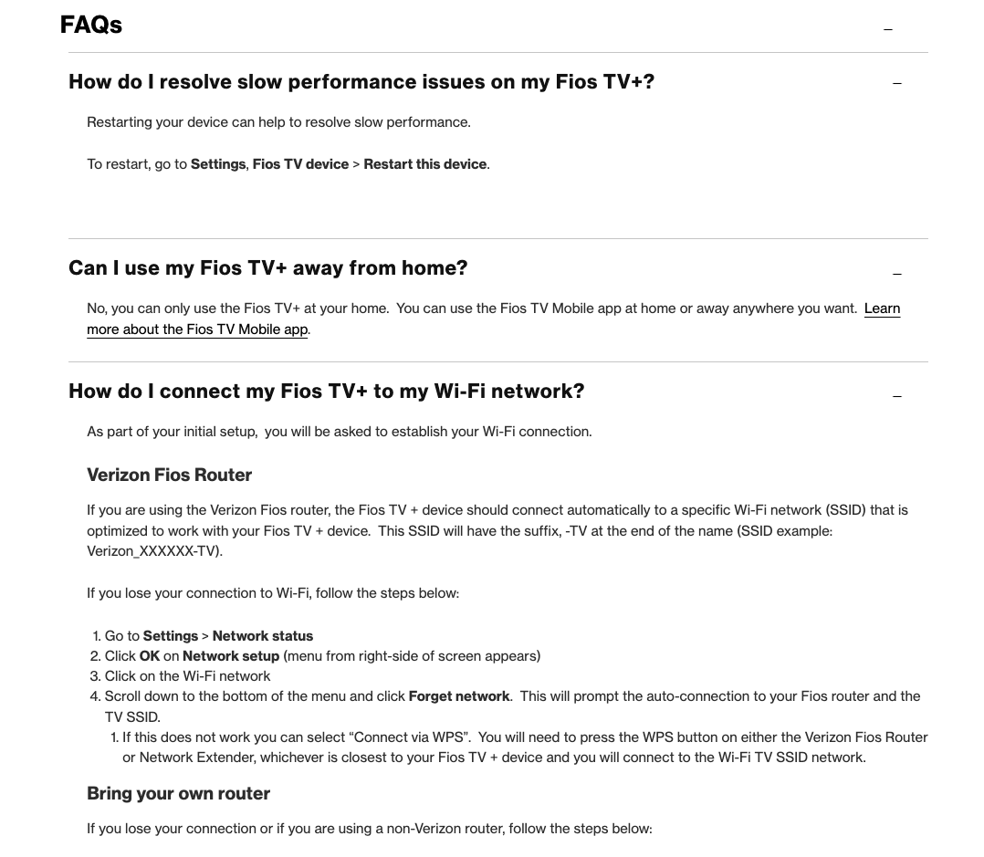
All FAQs are focused on supporting users with Fios TV+
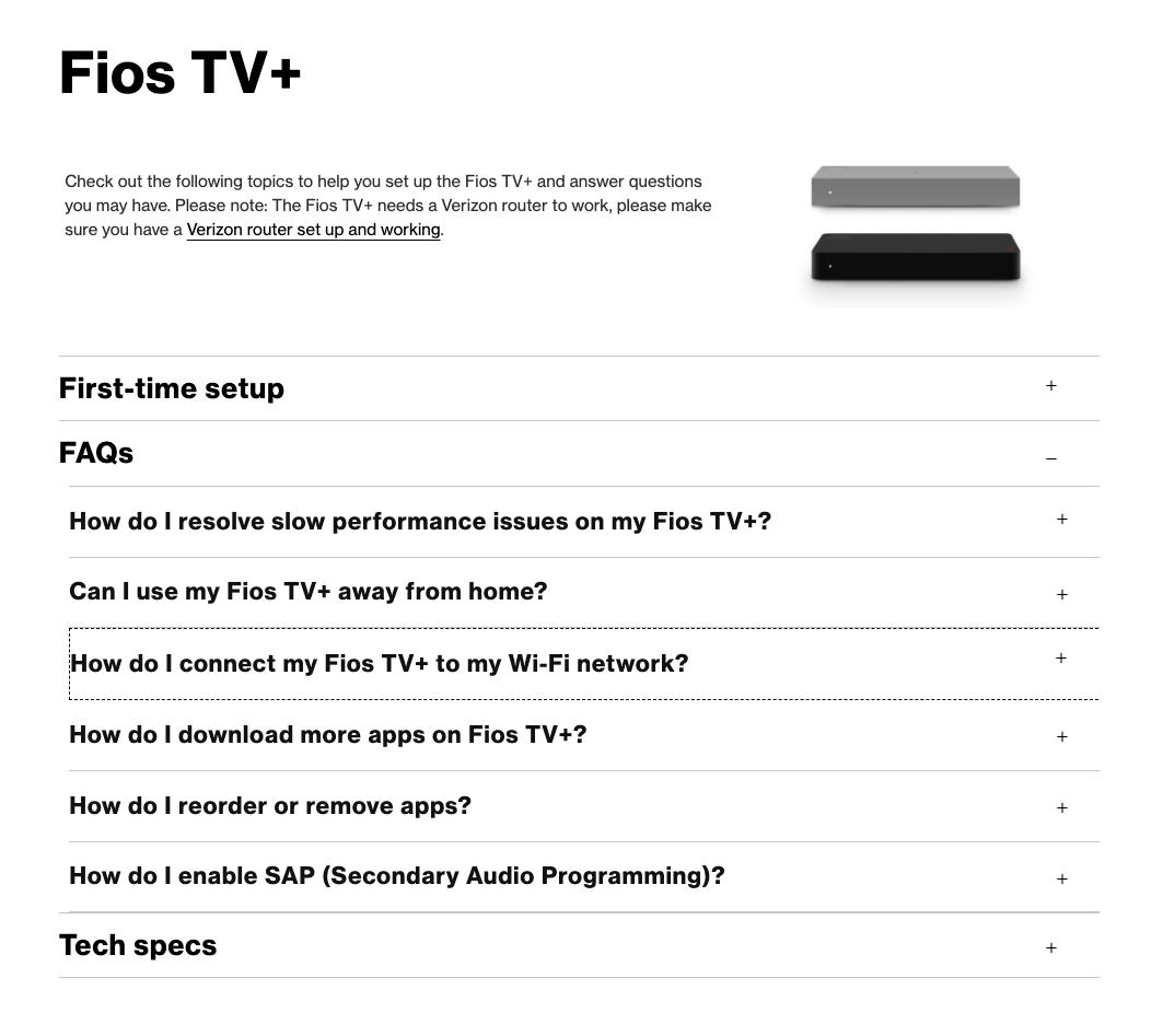
Answers are short and succinct, directions are bolded.
Outcome
Improved Engagement: Users reported that the website became clearer and easier to navigate. Breaking FAQs into product-specific sections with tabbed navigation reduced bounce rates, and overall there was a 20% decrease in the “bounce without viewing” rate.
Content Scalability: Built a reusable FAQ template and content principles later adopted across Cloud and Protect support experiences.
Strategic Precedent: Established a model for embedding UX writing and content strategy earlier in the support workflow, positioning content as a core design tool.
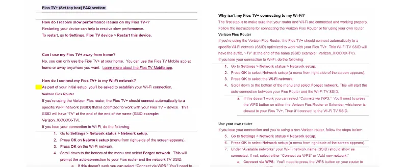
Before: Overloaded with copy. Unclear content hierarchy.
After: Content hierarchy is improved and FAQs are easier to find.
Reflection
This project reinforced that content strategy isn’t just about rewriting— it’s about rethinking the structure and system behind the words. By reshaping both the information architecture and the content itself, we created a support experience that was easier to navigate and built more trust with users. The work also set a precedent internally: UX writing is most impactful when it’s embedded early in design decisions, not added at the end.